Pro Program Live Chat +8619050185756

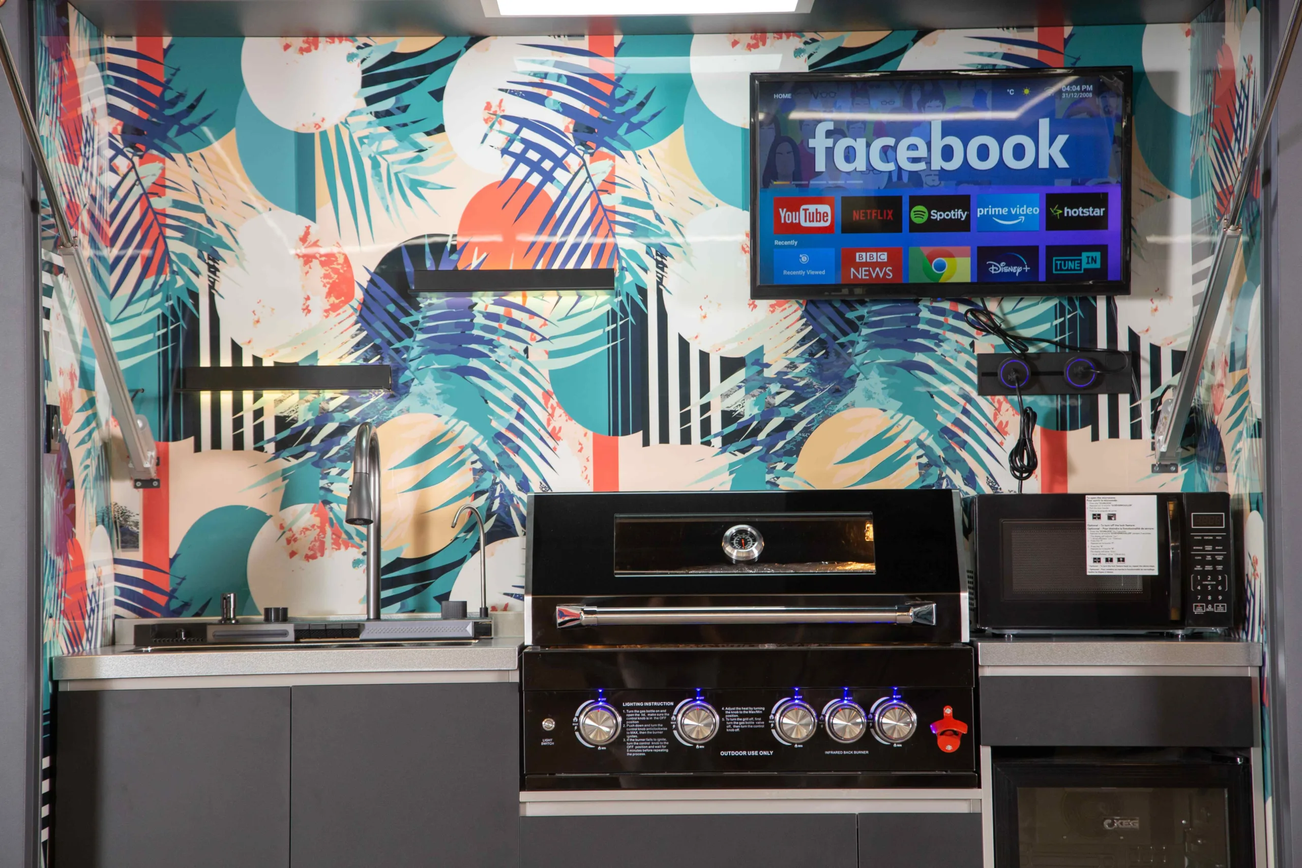
The easiest way to choose an outdoor kitchen color palette is to start with the home’s permanent exterior materials, select one dominant cabinet color, one countertop or backsplash tone, and one restrained accent. Repeat colors already present in windows, roofing, stone, paving, or railings so the kitchen feels connected to the property. Use bold patterns in one focal area rather than every surface, and confirm every finish is documented for exterior use before ordering.
Why Outdoor Color Decisions Feel Different
An indoor kitchen is viewed within one room. An outdoor kitchen must relate to the house, patio, pool, pergola, fence, landscaping, sky, and changing sunlight. A color that looks balanced on a small sample can feel much brighter or darker across a full cabinet wall.
Exterior light also changes constantly. Morning light may reveal warm undertones, midday sun can wash out pale colors, and shade can turn gray or blue. At night, integrated lighting may make the same finish look completely different. Evaluate the palette in the actual location rather than relying only on showroom lighting or a computer screen.
Begin With Permanent Site Materials
List the finishes that are expensive or impractical to change: exterior walls, stone, brick, roof, windows, doors, pool coping, decking, and major paving. Identify their undertones. A beige stone may lean yellow, pink, or gray; black window frames may be neutral or slightly warm; concrete may look blue beside warm wood.
Your outdoor kitchen does not need to match every material. It should repeat or deliberately contrast with two or three important elements. For example, dark cabinetry can repeat window frames while a pale countertop connects to pool coping. This creates unity without making the space look copied.
Use a Simple Three-Part Palette
Dominant Color
The dominant color usually appears on cabinetry, structural panels, or the largest visible surface. Neutral charcoal, black, gray, bronze, white, and taupe are flexible because they can support changing furniture and accessories.
Supporting Material
The countertop or backsplash provides the second major tone. It can echo stone on the house, introduce a natural texture, or create controlled contrast. Consider how the surface will look beside stainless steel appliances and under task lighting.
Accent
An accent can appear in a patterned panel, tile, lighting detail, bar stools, planters, or serving accessories. A vivid accent is most effective when it has room to breathe. Repeating a small amount in two or three places makes the choice feel intentional.
Quick Palette Comparison
| Palette direction | Visual character | Works well with | Watch for |
|---|---|---|---|
| Black, white, stainless | Crisp and contemporary | Modern homes, glass, monochrome paving | High contrast can show dust and fingerprints |
| Charcoal, warm stone, wood tone | Grounded and transitional | Brick, beige masonry, landscaped yards | Undertones must coordinate |
| White, pale gray, blue-green accent | Bright and coastal | Pools, light stucco, airy patios | Grease and organic stains may be visible |
| Bronze, cream, terracotta | Warm and Mediterranean-inspired | Tile roofs, stucco, warm paving | Too many warm tones can feel heavy |
| Neutral cabinets with one bold pattern | Personal and graphic | Simple architecture and controlled accessories | Competing patterns create visual clutter |
Should the Kitchen Match the House?
Exact matching is not required. A close but imperfect match can look accidental, especially when paint, powder coating, stone, and digital prints reflect light differently. Coordination is often stronger than imitation.
Repeat one house finish exactly where possible, then allow the remaining materials to complement it. If the house has black frames, repeat black on cabinet hardware or structure. If the home features pale limestone, select a countertop or backsplash with a related warm vein rather than searching for an exact artificial copy.
Light Versus Dark Cabinetry
Light cabinetry can feel open and resort-like, particularly beside a pool or pale architecture. Dark soil, smoke, grease, insects, and organic runoff may be easier to see. A light finish can also reflect more daylight into a covered kitchen.
Dark cabinetry creates definition and pairs naturally with stainless appliances and modern windows. Pollen, mineral spots, fingerprints, and light dust may become more noticeable. Dark metal exposed to direct sun can become hot, so consider hand-contact areas and follow product guidance.
Maintenance depends on exposure, finish texture, local water, pollen, cooking frequency, and cleaning—not color alone. Ask for real samples and model-specific care instructions.
How to Use a Bold Backsplash
A patterned or colorful backsplash can transform a compact outdoor kitchen into a focal point. Keep surrounding cabinetry and countertops relatively quiet so the pattern remains the intentional feature. Consider how appliance doors, television screens, shelves, lights, and outlets interrupt the design.
Scale matters. A small repeating pattern may feel busy across a wide wall, while a large graphic can be difficult to understand in a narrow bay. Request a full-size section or print a temporary mockup. Stand at the usual viewing distance from the patio and from inside the house.
Only use backsplash materials, inks, adhesives, substrates, seams, and edge details documented for exterior exposure, heat, moisture, ultraviolet light, cleaning, and the local climate. A visually suitable pattern does not establish technical suitability.
Coordinate With Stainless Steel
Stainless steel is visually neutral but still has a finish direction, reflectivity, and undertone. It can look cool beside creamy stone and warmer beside black or wood-toned cabinetry. Brushed surfaces, polished trim, appliance glass, and chrome faucets may all reflect nearby colors differently.
Repeat metal finishes deliberately. If the grill, refrigerator, sink, faucet, and handles are visibly different, simplify the surrounding palette. Avoid adding several unrelated metallic accents unless the design intentionally mixes them.
Use Landscaping as Part of the Palette
Green foliage acts like a major color field around an outdoor kitchen. Dark cabinetry can recede against dense planting, while white or patterned panels stand out. Seasonal flowers and deciduous trees change the background, so permanent kitchen finishes should work with the yard even when accent colors disappear.
Planters are an easy way to connect kitchen colors to the landscape. Repeat the cabinet tone in containers or use pots that echo paving and stone. Keep plants outside grill clearances, ventilation openings, appliance service areas, and circulation routes.
Lighting Can Change Every Finish
Warm lighting softens black and gray and can make white surfaces appear creamier. Cooler light can emphasize blue undertones and create a crisp appearance, but it may conflict with warm stone or indoor lighting seen through nearby windows.
Test finish samples under the proposed task and ambient lights. High-gloss surfaces can reflect individual light sources, while textured or matte finishes spread light more softly. Lighting equipment and electrical installation must be suitable for the exposure and completed by qualified local professionals.
Color Selection Checklist
- Photograph and collect samples of permanent exterior materials.
- Identify warm, cool, and neutral undertones.
- Select one dominant color, one supporting material, and one accent.
- View physical samples in sun, shade, and nighttime lighting.
- Check the kitchen from important indoor windows and doors.
- Coordinate cabinet color with appliances, handles, sink, and faucet.
- Use bold patterns in one controlled focal area.
- Confirm every material and finish for exterior exposure and heat.
- Consider visible pollen, dust, grease, mineral deposits, and irrigation spray.
- Ask about matching accessories, replacement parts, and touch-up options.
- Create a full-size mockup before approving a large pattern.
- Keep required ventilation, clearances, and service access unobstructed.
Avoid These Common Color Mistakes
Do not select every material independently. A favorite countertop, cabinet, backsplash, paver, and furniture fabric can compete when combined. Review them as one board in the actual site light.
Avoid near-matching the house when the manufacturing processes differ noticeably. Choose a deliberate contrast instead. Do not use an image from another climate as proof that a finish will perform at your site. Finally, do not let aesthetics cover ventilation openings, drainage, labels, controls, or required clearances.
Coordinate the Palette With the Kitchen Format
A compact integrated kitchen can carry a stronger graphic treatment because the design is contained within one visual frame. A long built-in kitchen often benefits from calmer cabinet colors and controlled variation across the countertop and backsplash.
Review Meta Lifestyle’s outdoor kitchen collection to compare cabinet, appliance, panel, and sheltered configurations. Confirm available colors, materials, exterior suitability, care requirements, and model-specific installation details before finalizing a palette.
Frequently Asked Questions
What is the most timeless outdoor kitchen color?
Neutral charcoal, gray, white, bronze, and warm stone tones are flexible, but timelessness depends on the home. Repeating an existing permanent exterior finish usually ages better than following an unrelated trend.
Should an outdoor kitchen match a pergola?
They can match, but coordination is enough. Repeat the pergola color in cabinet structure, handles, lighting, or furniture while using a complementary countertop or backsplash.
Do black outdoor cabinets get too hot?
Dark surfaces in direct sun can become hot. Actual temperature varies with finish, exposure, airflow, and weather. Avoid touching sun-heated metal and follow model-specific product guidance.
Can I use bright colors outdoors?
Yes. Use a vivid color or pattern as a controlled accent and confirm the complete finish system is documented for ultraviolet exposure, weather, heat, and cleaning.
How many colors should an outdoor kitchen have?
Three major elements—a dominant color, supporting material, and accent—are a practical starting point. Appliances and landscaping add additional visual tones, so restraint helps.
Should the countertop be lighter than the cabinets?
Not necessarily. A lighter counter creates contrast and can brighten the work surface; a darker counter creates a more unified look. Compare samples for glare, staining visibility, heat, maintenance, and exterior suitability.
Bottom Line
A successful outdoor kitchen palette belongs to its setting. Start with permanent house and patio materials, control the number of major colors, test real samples in changing light, and use bold design in one intentional focal area. Then verify that every selected finish, substrate, appliance relationship, and installation detail is suitable for exterior conditions.